Tuesday, October 8, 2013

Sennelier Pastels - Half Stick Set of 80 Landscape Colors - Review

I received this gorgeous set of pastels for my birthday, and I have almost finished my first painting using them.  Overall, I really like this set, and thought it might be helpful to post a review.


The Sennelier brand was created when Gustave Sennelier, a chemist by trade, opened his first shop in Paris in 1887.  His soft pastel line was introduced in 1900 at the request of Edgar Degas.  From that time to the current day, Sennelier pastels have been made by hand, and dried for four weeks, using only the finest pigments - with no fillers added.  The Sennelier soft pastels come in a range of 525 shades, being sold in sets or as individual sticks.  In addition to the full size sticks (2 1/2 inches long by 1/2 inch in diameter), they are also available as half sticks (1 1/4 inches long by 5/8 inch in diameter), and La Grande size (approximately the size of 8 standard sticks).  The half sticks are sold without a wrapper and are thicker than the standard sticks, to create added strength.  They are a great way to sample more colors for less money.  They also save those of us who just tear off the wrappers and break our sticks in half anyway, the trouble of doing so.  They are a good size for nice broad strokes using the side of the stick.  

My impressions of this set are mostly very good, with one (rather large) complaint.  The colors are rich, beautiful and luscious.  Every time I sit down with them I fall in love with the colors all over again.  It is also, in my opinion, a very good selection of colors - flexible and well suited to a variety of landscapes.  For the most part (you can hear my complaint on it's way here!) the texture is wonderful.  They are very soft and have that creamy feeling that pastel artists love.

The problem is this:  they are inconsistent.  I seem to be running into trouble most often with the very dark colors.  Some of them are too hard or kind of grainy - to the point of being scratchy.  This is a big problem for me and I don't even like to use the sticks that behave this way.  There have only been a few this bad in my set of 80 colors, so it is not something that makes me regret buying them, but it is surprising, given the quality of the majority of the colors.  The other thing to keep in mind is that some of them are quite crumbly.  They need a gentle hand.  This is, in my experience, typical of very soft pastels - but I still thought it was worth mentioning.

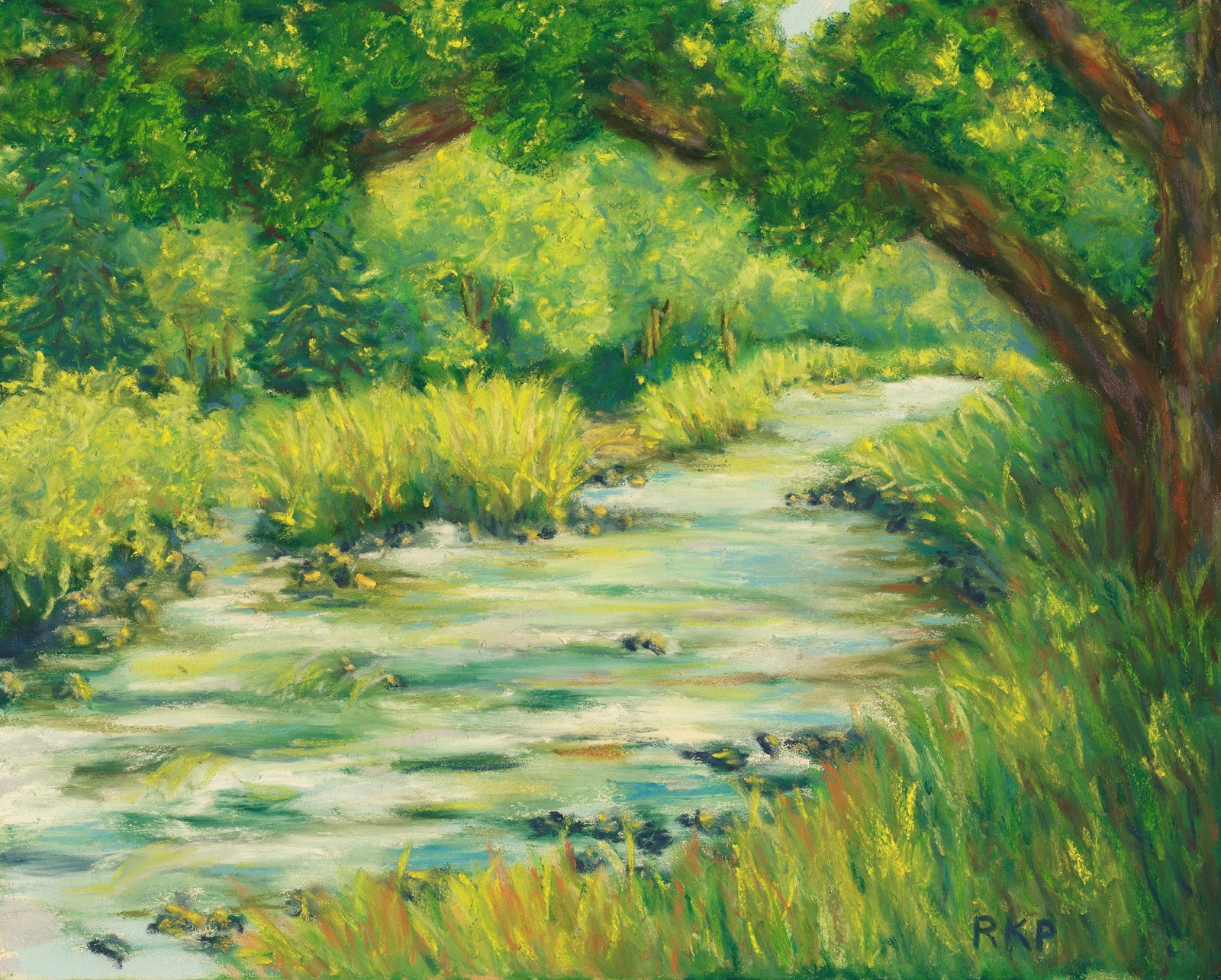
Overall, I would definitely buy the set again.  In the future I will probably purchase them individually, in order to avoid the problem sticks.  But starting out with the set was very useful and I am enjoying them a great deal.  Below is a progress photo of the beginning stages of the painting that I am currently working on - using exclusively this set.


Sunday, September 8, 2013

Building an Art Studio

I am very excited - my husband is going to build me an art studio!  Presently, I am using the dining room table with a tabletop easel, keeping my pastels stacked in boxes on a chair.  When I am using my pastels, they end up spread all over!  This is, obviously, not ideal.  Suffice it to say, that we often end up eating dinner at the kitchen counter instead of at the dining room table.  Then there is the ever present problem of pastel dust.  I do my best to keep things tidy, but I worry about it getting into the carpet, into food, etc.  I would show you a picture of my current set up, but I am not that brave!

We have just begun the planning stage.  We have a spot picked out behind the house - a beautiful spot in the middle of a young grove of oak trees.  We have established that we are going to make it 12x16 feet, and have stomped around in the brush making sure that it would fit.  Ah, the excitement of the planning before the real work begins - my favorite!


I have gotten onto floorplanner, and spent some time trying to figure out how I will have things arranged in the new studio.  Did I mention that my treadmill is going in there too?  Floorplanner is a great website, where you make an account (for free) and they have all kinds of neat tools, not just to make a floor plan, but to fill it up with stuff (yes, they actually have a graphic for the treadmill). It is all to scale, and a very useful tool for getting organized.  You can not only see how your furniture will work in the room, but it is really handy for making sure that you don't make silly mistakes.  Like planning on putting your pastel table right where the door needs room to open.  Not that I am saying I did that....

I am working on how to most efficiently set up my pastels and my easel.  I would love to hear any advice from those of you who have gone through this process before.  I much prefer learning from other people's experiences, instead of learning the hard way by making mistakes!  I am currently thinking of having the standing easel towards the middle of the room but facing the front windows.  The light will be filtered, but fairly consistent, as it will be coming through the oaks most of the day.  (See the photo below)  I am hoping that there will be enough ambient light, at least on fairly bright days, but I am sure that I will have to have some additional lighting for those dark, rainy, Pacific Northwest days!  Then I was planning on a long table off to the side to hold pastels and to work sitting at when I am painting smaller pieces.  Or maybe a table for pastels, and a second table, arranged so as to make an L shape, for sitting and painting?  There will of course have to be some storage.  That treadmill is really going to be feeling crowded!


We are hoping to start clearing the site this weekend - wish me luck!  (Really, please do - we suspect that there is a nest of bald faced hornets in there somewhere!)


Tuesday, August 13, 2013

Pastel Painting Demonstration of a Foxglove


"Foxglove", Pastel on board, 5x7
Available through Etsy


I'm pretty happy with this one!  It came together more easily for me than usual.  I took a couple of pictures of it as a work in progress:

First I did a sketch on green Ampersand Pastelbord.  I really like this surface because it can take as many layers of pastel as you could ever need, and it is very tough.  I have had times where a painting wasn't going well, and I just took it to the sink, rinsed it off, let it dry, and started over!  I work different ways, depending on the painting, but this time I wanted to focus on the detail of the flowers first, as I intended to keep the background abstract.  First I put in a light layer of dark blue where appropriate, to remind me of where the darkest shadows would be.  Then I started working on the flowers and stem, moving from top to bottom.  I was trying to get a good amount of detail, while still looking "painterly".  


I was having a hard time getting the color that I wanted, and I found that starting with a very bright pink background, and then layering on cream, with touches of peach, green, blue and yellow worked for me.  Sometimes you get better colors with layering, than if you just pick the right color out of your box!  The green background was fun to work on as it really made the flowers jump out as I went along.


I paid special attention to where the sun was hitting the flowers, and tried to give a bit more emphasis to the ones in the lower center and left, as they were my focal point.  Here is a closeup:


When I had finished the flowers, I decided that they needed to be warmed up a bit, and went over them here and there with yellow and peach, and just a bit more of that bright pink.  Putting in the background was fun, and the only things to pay attention to were keeping a good balance of the colors that I was using, and keeping the dust from the dark colors off of my pale flowers!  A few touch ups and I was done!


Thursday, July 25, 2013

Pastel painting - "Fog Rolling In"


Fog Rolling In, 5x7, Pastel on board


I was in the mood for something moody today!  I had a hard time getting this one to look on the computer like it does in the painting - but this is pretty close.  In the original painting, the bottom looks a little more blended.  I made this one while sitting at our picnic table, in the shade of an oak tree.  It is about 85 degrees without a cloud in the sky, so I guess this is sort of an odd choice for such a beautiful day!  But I find I enjoy myself much more if I just paint whatever I am in the mood for at the moment.  If I try to force something that I had planned on and no longer feel like, it is always a struggle.  

My daughter saw what I was working on and ran in to get her own art supplies.  
Here is her version of my painting:


It was a fun morning!

Monday, May 27, 2013


Oak Over the River - Scotland
8x10, Pastel on Ampersand Pastelbord

Anyone who lives in Scotland or has visited there knows that they have some very beautiful rivers!  This one was breathtaking with the evening sun lighting everything up.  A magical place!  Available through Daily Paintworks.

Thursday, May 23, 2013


Cherry Blossoms, 8x10, Pastel on Board

This was a challenge for a pastel group that I belong to - I enjoyed it more than I thought I would!  Cherry blossoms are one of the most cheerful signs of spring.  Currently on auction through Daily Paintworks.

Sunday, May 19, 2013


English Countryside, 11x14, Pastel on board

The English countryside in full summer - everything is so green!  Prints are available through Fine Art America.  I hope you like it!